Talking UI/UX with Trey McKay

Trey McKay was kind enough to let me ask him a bunch of questions. Trey’s an Interaction Designer at Shapeways, which is a global 3D printing service and marketplace.
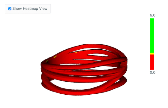
Trey focuses on designing and building experiences for turning 3D designs into 3D printed products. He’s worked on everything from site-wide navigation redesigns to a suite of 3D tools, which help product designers identify and fix potential issues in their designs before they go into manufacturing. If you want to stalk him on the Internet, check out his personal site or holler at him on the Twitter @trey_mckay.
Liz Flyntz: What is the thing that is most misunderstood about user interface and user experience design, in your opinion?
Trey McKay: In general, I’ve noticed that a lot of folks think that the role of a designer is to “make something pretty”. From coworkers to general public, I think there is a common misconception about what design is, how important it is, and what we as UX/UI designers do on the day-to-day.

Design is how something works. Good design is transparent, as the saying goes, because when something is properly designed, it’s not getting in the user’s way. Well-designed products and services help people get stuff done, save them time, make their lives easier. We only notice design when it’s not doing those things for us, when it’s not helping us solve problems or is causing us frustration by being unclear, unhelpful, or distracting us from completing our tasks.
Here’s an example: Let’s say as an interaction designer I’m working with a developer on a login form for the website. When I start to work on this page I add interface copy and spacing to UI elements to help clearly communicate what things do, what the user is expected to input. I group labels with their form field and work with color to make it clear what elements are clickable and what they need to interact with first.
Now the common reaction for someone looking at this interface again after I’ve worked on it is likely, “Wow this looks a lot better” or something along those lines. I think this is where the “designers make things pretty” mentality comes from for the person who doesn’t work with designers often or at all. But a good developer knows that a lot more is going on than simply making something look “pretty”. They’ll know that the login form is more understandable at first glance, easier to use to complete your task, and has copy that is more helpful.
LF: What are your must-have items of documentation? Do you always make user/use cases and workflows, for instance?
TM: For me personally, the most important and must-have item 100% of the time is a clear problem statement, i.e. “What is the user problem that we’re solving here?” Once you have that clearly stated, and agreed upon, it becomes much easier to keep projects focused and design something useful.
Usability testing, user research, focus groups and the like are excellent tools for truly understanding where users have problems in your experience, and why they’re having them. Workflows are essential for making sure that a user can get from point A to point B without any unnecessary steps, without any pitfalls or dead-ends in the experience.
It’s important to get them sorted out as early into a project as possible, because if you end up focusing on details of a specific interface or step in the flow, without the flow itself figured out, then you may end up realizing later that the thing you spent all that time and energy on isn’t necessary at all. That’s a terrible feeling, trust me.

LF: What are your preferred tools for producing deliverables? What are some tools you would like to try?
TM: The deliverables themselves, and the tools with which to create them, are heavily context-dependent. Meaning that different stages of the design process require different deliverables. The general rule of thumb that I’ve adopted for my work is to stay as low-fidelity as possible, for as long as possible. The goal there being that you end up staying much more agile and open to change, spend less time chasing down details that may not matter in the long run, and more likely to end up with something useful.
Because low-fi tools require a small amount of time and energy, you as a designer don’t feel any attachment to them if you need to scrap your idea or start in a new direction. The more time you put into details on something, the more of an emotional attachment you build to it, and the less open you are to change (bad!). So it’s important, especially early in the design process, to work as low-fi as possible. Move quickly, explore lots of directions, and then over time you can refine your ideas as you move into higher-fidelity mediums like wireframes or comps.
When I make medium-fidelity wireframes, I use Sketch. I prefer Sketch over tools like Photoshop or Illustrator for doing wireframes because it was designed from the ground up for doing UI design. There are a lot less unnecessary tools, and there are a ton of useful plug-ins around the Internet for doing various things in Sketch specific to UI design, and generally I’ve found my workflow to be vastly more efficient as a result. Photoshop in specific feels incredibly slow and inefficient for my process because it is a photo manipulation tool at its core.
Lastly, my preferred hi-def tool is working directly in the browser. Working straight in HTML and CSS (we use Scss at Shapeways), I’m able to leverage the extensive front-end framework we’ve already built. We’ve got tons of CSS already written which helps me move as fast as possible, and really see exactly what the end result will be in a variety of browsers, on different devices, etc. CSS makes working with repetitive elements really efficient, as you can make broad, sweeping changes all in one go. Gone are the days of the “pixel-perfect” Photoshop comp. Go directly from medium-fidelity wireframe to hi-fidelity prototype in your browser, and profit.
LF: What’s special about the UI needs of a highly specialized product/userbase like your company?
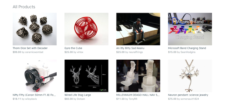
TM: One of the biggest challenges that we face here is designing for the sheer variability of what our users can create, buy, and sell on our platform. We have an e-commerce marketplace that functions on the top-level like many others, but we’re also responsible for manufacturing and shipping those products. The things you buy on our marketplace may never have existed before, and that’s a very special thing to design for.

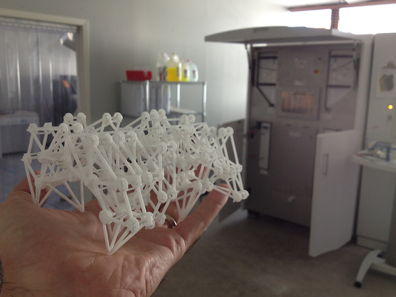
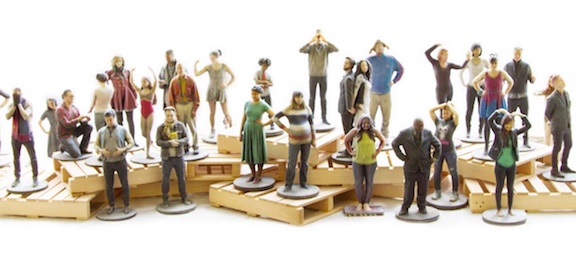
From a UI-design perspective, that forces you to account for a potentially unlimited amount of edge-cases. How do you design interfaces that serve people selling insanely complex mathematical art pieces that are generated from algorithms, high-end designer jewelry, and also scale miniatures? How do you design shop management interfaces for selling those same products in any of our 50+ 3D printing materials? It forces you to design for scale, flexibility, and inherent usability. There’s no room for “fluff” or unnecessary interface elements.
LF: You are in-house, so I think that makes a difference; have you worked for clients before? What do you do when there is a mismatch between clients’ design wants and what you feel are user requirements?
TM: I have worked for clients pretty extensively actually. I think there’s a correlation for in-house folks when they’re working with partner teams like marketing, business, etc. Generally, when there’s a mismatch between what a client wants, and what a user needs, it’s my job to educate my client the best I can as to why the user needs that, and why it’s important for the success of the project. I always feel that it’s my responsibility to be the loudest voice for the end-user. I generally try to be firm with clients, because in most situations, happy users make for happy clients. Hard to argue that! Though as with all things, there’s always a tradeoff to be found in most situations.
art ecommerce testing community

Comments